01
Modular Identity
The mark is the module itself, in its opening position. 36 cell, 6 gutter, 120 frame. Lighting up different cells produces the campaign's tempos — the same frame, a different rhythm — which is what makes it modular in construction, not just in name.
01 — Rise primary state / logo
02 — Fall closing frame / end card
03 — Burst launch / peak moment
04 — Sustain always-on / retention
Mark assets/mark.svg · gold on ink
Layout Grid every format is cut from it
02
Intensity Levels
Same copy, same format, four temperatures. Level is a data attribute, not a redesign — which is what keeps a campaign from drifting when it runs for six months.
Level 1 — Subtle flat ink
Level 2 — Hatched exposed grid lines
Level 3 — Signal particle sweep
Level 4 — Full reversed gold field
03
Display Formats
Four IAB sizes from one component. Each piece sizes itself using container query units, so the specimen on this board and the delivered file are literally the same markup — the banner isn't redesigned per size, it recomposes.
Billboard 970 × 250 · level 3
Leaderboard 728 × 90 · level 2 · the support line drops
Skyscraper 160 × 600
MPU 300 × 250 · level 4
Format Matrix relative scale, 1:10
04
Social Formats
1:1, 4:5, and 9:16 — the three ratios that cover every feed and story placement. The story gets extra bottom clearance so the CTA clears the platform's own UI.
Square Feed 1:1 · level 3
Portrait Feed 4:5 · level 4
Story 9:16 · safe area respected
05
Sample Dashboard
The reporting module that ships with the kit. The tiles report facts about the system itself — those are real and countable straight off this page. The charts carry synthetic, illustrative series: they exist to show the layout, the chart spec, and the interaction — not to describe any campaign that actually ran.
Campaign System — Reporting Module
Illustrative DataBase Modules
9
cells in the 3 × 3 grid
Formats in Kit
7
4 display · 3 social
Intensity Levels
4
subtle → full
Components Redesigned
0
one component, every size
Creative Format Index, Weeks 1–8
Illustrative series · index, 0–80 · hover a week to see values
Static Motion Carousel
View as table
| Week | Static | Motion | Carousel |
|---|---|---|---|
| W1 | 38 | 22 | 30 |
| W2 | 41 | 28 | 33 |
| W3 | 45 | 34 | 35 |
| W4 | 48 | 43 | 38 |
| W5 | 52 | 51 | 41 |
| W6 | 55 | 62 | 44 |
| W7 | 57 | 71 | 47 |
| W8 | 61 | 78 | 49 |
Creative Mix by Placement
Illustrative distribution · index, 0–100
06
Portfolio Card Composition
Case 03 occupies a full-bleed dark block in Selected Work, so this composition is 16:9 instead of 4:3 — three devices carrying three intensity levels of the same campaign.
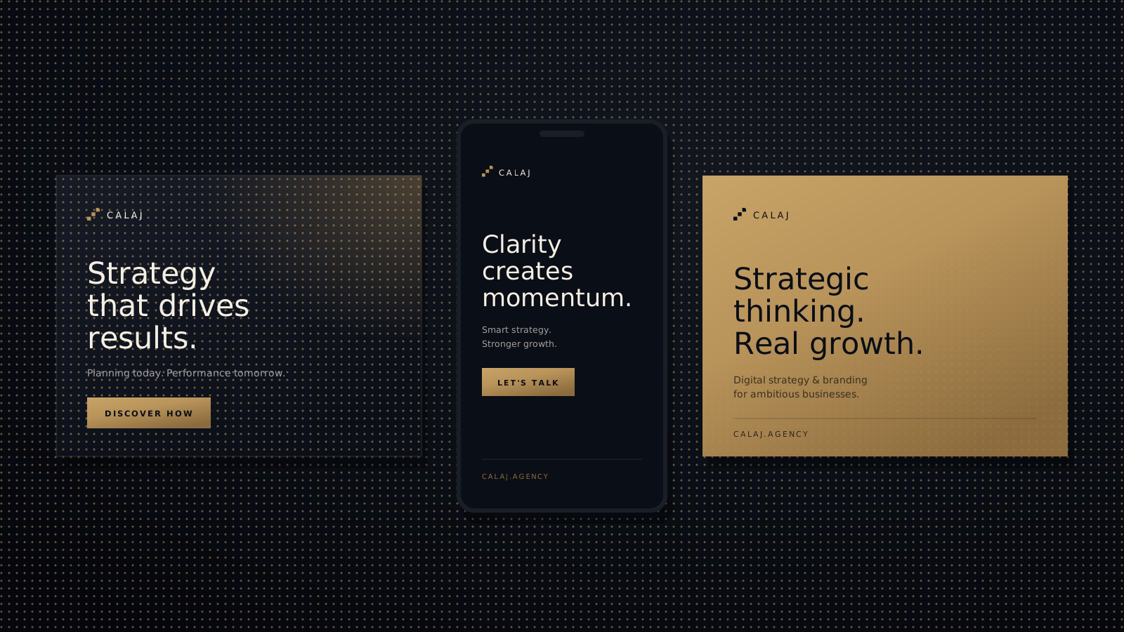
card.svg 1600 × 900 · 16:9 · self-contained
07
Case Summary
Brief
Campaigns drift. Week one has art direction; week twelve is whatever fit the deadline. The brief was to make consistency the cheap option, not the disciplined one.
Approach
Show the system instead of hiding it. One component, sized by its own container, plus an intensity attribute. Changing a banner's temperature is an attribute swap, not a redesign.
What the System Delivers
Seven formats and four levels come from a single markup component and one stylesheet. The reporting module ships in the same visual language, so the campaign and its reporting don't read as two different products.