01
Visual Identity
The V isn't a drawn letter. It's what's left when five contour lines are stacked and each one loses exactly 19 units of width. The ends fall on two precise diagonals — which is why the eye closes the V even though no diagonal exists in the file.
Mark stone on bark · assets/mark.svg
Reversed bark on stone
VERDEO
Architecture · Landscape
Lockup on moss
02
Website Concept — Desktop
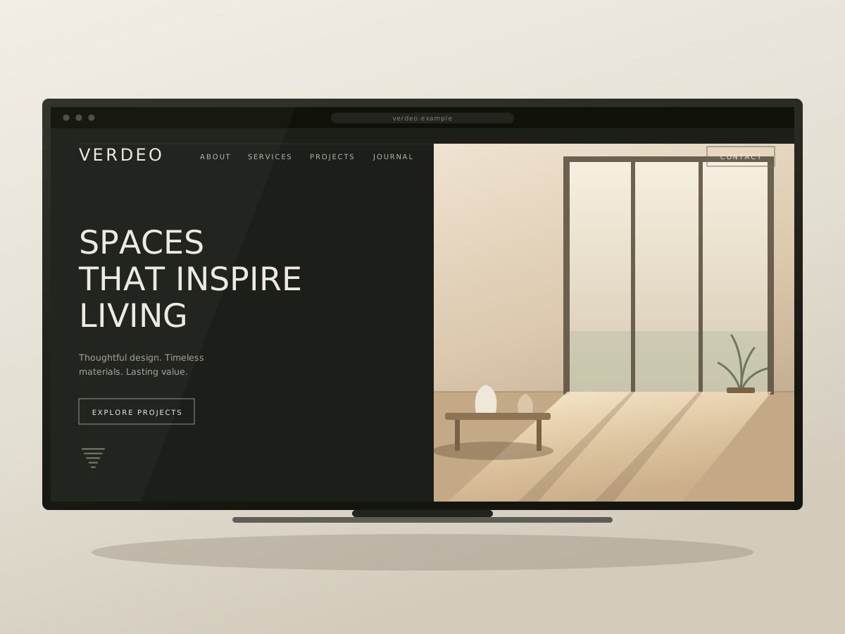
The hero splits 1.05 : 1 — the text column a touch wider than the image, so the headline sets the pace instead of competing with it. The browser chrome is CSS, not a screenshot: the text below is real, selectable text.
Selected Work
03 / 12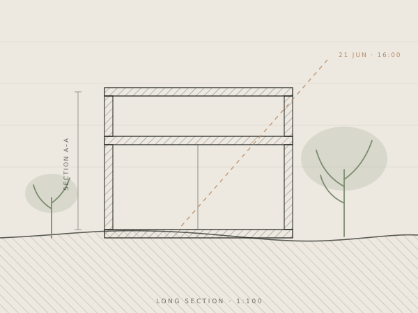
Homepage nav + hero + work grid · in real HTML/CSS
03
Website Concept — Mobile
On mobile the split collapses and the order flips: headline first, then the image. The nav keeps only the wordmark and the one CTA — the four links move behind a menu, because a four-item bar at 320px would shrink the type below the tracking the system depends on.
Mobile Hero 390px · text before image
Work
12Mobile Work Index 390px · single column
04
Typography & Navigation Detail
Instrument Serif carries the voice — lighter and wider than a didone, which is what keeps the studio from reading as a luxury brand. Cabinet Grotesk handles everything that needs to be read fast. Navigation tracking is fixed at 0.19em and never shrinks: that's why the mobile nav hides the links instead of squeezing them.
Display Instrument Serif · 400 · uppercase · 1.08 line-height
Spaces that inspire living
Opening Line Instrument Serif · 400 · sentence case · 1.45 line-height
A studio that works in the space between the building and the ground it stands on.
Navigation Cabinet Grotesk · 400 · 0.19em tracking · uppercase
About Services Work Journal
Drawing Label Cabinet Grotesk · 400 · 0.24em tracking · clay
Longitudinal section · 1:100
05
Project Drawings
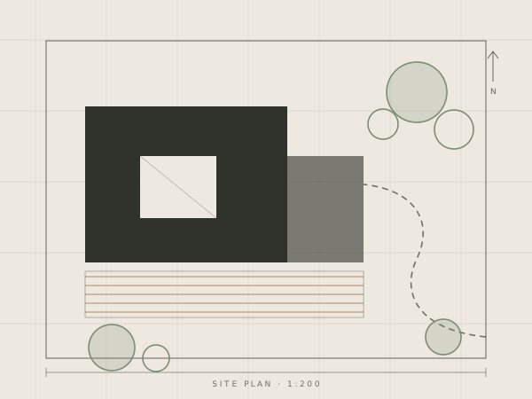
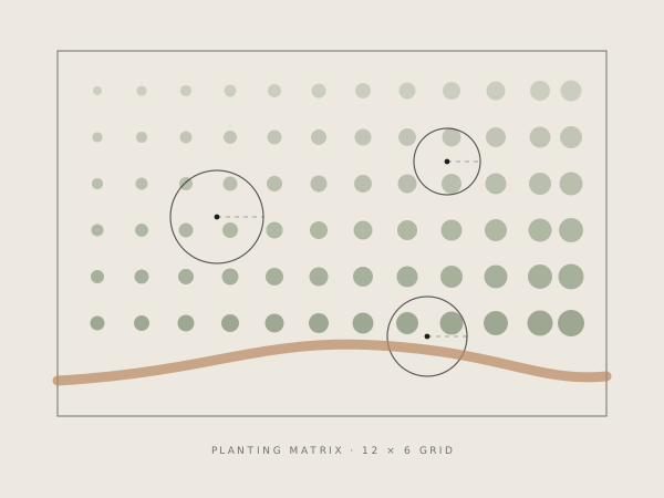
The three drawings that fill the work grid. Site plan, section, and planting plan — one for each side of the studio's practice. No photography is used in this identity, and that's a rule of the system, not a limitation of the concept: a studio with no finished builds should be showing drawings.
Site Plan assets/plan-site.svg · 600 × 450
Section assets/plan-section.svg · 600 × 450
Planting Plan assets/plan-planting.svg · 600 × 450
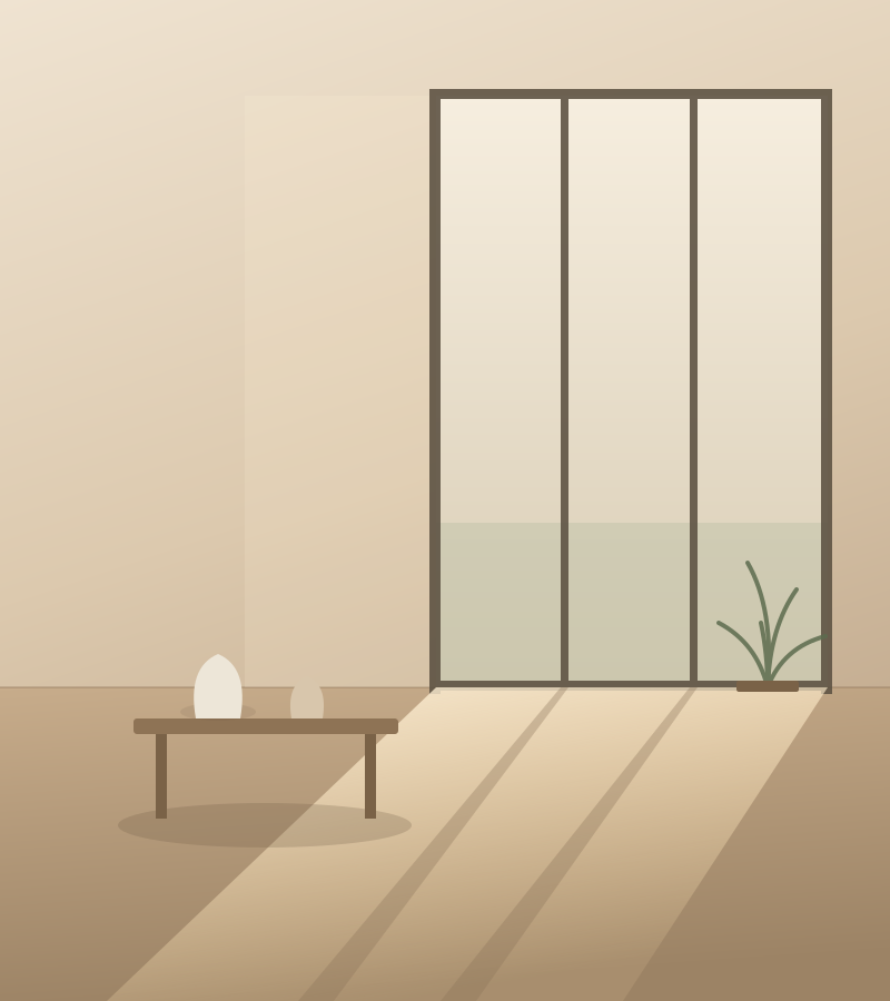
Light Study assets/light-study.svg · hero image, in place of photography
06
Portfolio Card Composition
The 4:3 composition for .work-case__media. The light study is redrawn inside the
file, rather than linked, so the card keeps rendering when the SVG travels alone — in an
email, a PDF, or dragged straight into the browser.
card.svg 1200 × 900 · 4:3 · self-contained
07
Case Summary
Brief
An architecture and landscape studio with a portfolio that's almost entirely unbuilt. The usual answer — licensed interior photography — would show someone else's work.
Approach
Change genre instead of sourcing images. Drawings are what a studio produces before there's anything to photograph, so the identity is built in that language: hatching, contour line, dimension, sun angle.
What the System Delivers
New projects go up as drawings, not photo shoots. The grid, nav, and type scale hold up from 390px to desktop, and the studio can publish a project the same week it's drawn.
Concept project. Verdeo is a capability demonstration created by Calaj Agency
itself. There is no client or completed build behind it. The project names, drawings, and the
verdeo.example domain are examples; no result, metric, or testimonial is
claimed anywhere on this board.