Brand Strategy · Visual Identity
Aurea
A visual identity for a strategy consultancy that sells judgment, not slide decks — built around one idea: the gold thread, the line of reasoning that keeps running long after the project ends.
AUREA
Strategy · Design · Growth
Context
The Brief
Aurea is a concept created by Calaj itself: an independent strategy consultancy that needed to look established from day one, without borrowing the visual language of the corporations it advises.
A four-person strategy consultancy, one year in, competing for the same clients as firms ten times its size and age.
Strategy consulting — a premium, trust-based service where the product is judgment, not something you can photograph.
No photography budget and no in-house design team. The system needed to look expensive using only typography, one accent color, and paper.
Concept exercise — fictional brief
Imagine Aurea approaching Calaj with this problem: “We charge more than most consultancies our size, but our proposals look like any other PDF landing in a founder’s inbox. People need to trust the thinking before they read a single slide.”
This brief was written by Calaj to exercise the process end-to-end — it isn't a real project. Aurea has no real founders, clients, or revenue. See the notice at the end of this case for the full disclosure.
Strategy
One Idea, Not a Mood Board
One idea, expressed structurally rather than decoratively. The monogram's extended crossbar becomes the rule under the logotype, the divider on a slide, the thread on a card — the same gesture at every scale.
Closer to a private bank or an auction house than a startup consultancy. Reserved, ceremonial. Hierarchy is built with space and line-height, never with weight.
One gold element per piece. The moment a second one appears, gold stops being an accent and becomes decoration — obsidian and ivory are what carry the work.
Identity
The System
A didone A — thin stroke on one side, thick on the other — with the crossbar extended past both strokes. The counterform is never drawn: it's what's left between the strokes and the bar.
Palette
Type System
Display · Bodoni Moda
Clarity is a competitive advantage
Logotype · 0.22em tracking
AUREA
Body · Cabinet Grotesk
Every project produces one page before it produces a hundred. The system is built so that page feels like the most important object in the room.
Applied to Digital Touchpoints
Aurea
Strategy · Design · Growth
hello@aurea.example
aurea.example
Deliverables
What Was Delivered
- Brand concept and personality
- Monogram with construction grid and clear space
- Vertical and horizontal lockups
- Six-tier palette with usage rules
- Type system with four roles
- Business card, front and back
- A4 proposal cover
- Three presentation masters
- Email signature, social post, avatar, and favicon
- Portfolio card composition
Gallery
Selected Pieces
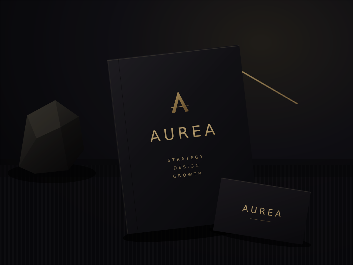
AUREA
Strategy · Design · Growth
AUREA
Learnings
What This Project Demonstrates
Creating a rule — one gold element per piece — that has to be actively defended everywhere is harder than adding decoration. And it's what separates a mark from a brand.
The extended crossbar had to work as a monogram detail, a slide divider, and a card thread without becoming three disconnected decisions. That consistency is deliberate craft, not a coincidence of the grid.
Because it's a concept project, Aurea has no real contract or performance data. This case documents the system Calaj built and the decisions behind it — not results, because none exist.
Start a Project
Want a system this disciplined for your brand?
Calaj builds the same way for real clients: one idea, carried through by strategy, identity, and every application it touches.